I work with UX.
I've been practicing UX- & Product design for 17+ years, working with various companies building digital products together with great people in a mix of well-established companies to startups.


Every project is unique.
So we adapt the process. Together.
Whether you’re looking to revamp the design for an app or optimising your e-com funnel I bring an experienced perspective and methodology on how you best can become successful with your project.
Throughout my career Ive been able to gather experience from working with UX methods that is applied in projects that I take on.
Experience & Methods
UX Design
Customer research (e.g Interviewing)
User testing
Workshop facilitating
User journey mapping
UX documentation
UX Audit
Product design
Flowcharts
Wireframing
Prototyping
Design system
UI design
Brand design
Brand platform
Communication & Marketing
2024
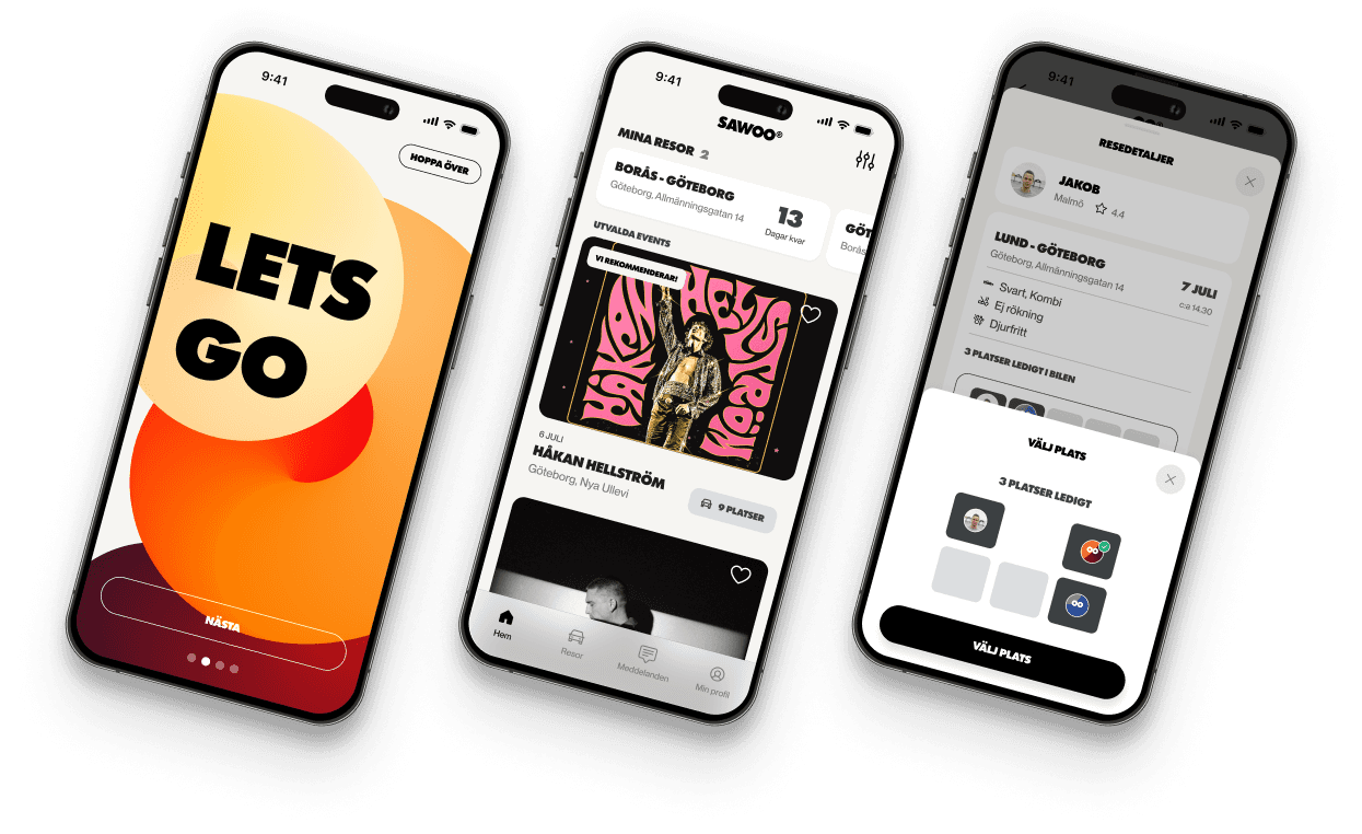
Sawoo is a ride sharing platform with the ambition to make it easy to share rides while reducing carbon emission and making the world a better place.
My role with Sawoo was working together with the team to establish user flows, wireframes and UX+UI design.

2021-2024
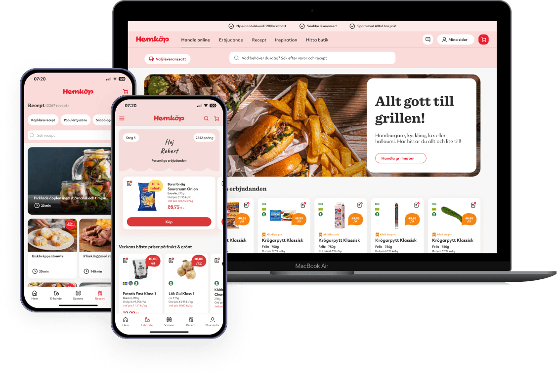
Hemköp wanted to update their mobile app UI and website which led to a journey working with UX & UI for several channels such as E-com, Inspirational content and CRM marketing.
With Hemköp I’ve been working as lead UX designer with responsibility for team delivery in terms of discovery & insight to concept and UX+UI design with design component system.
Get in touch
Tolvhundra AB
Gås-Anders Väg 17
SE-743 64 BJÖRKLINGE
Org.nr: 559116-9197